How to Add a Theme Toggle to Your Framer Website
Framer has built-in support for dark and light modes, but it doesn’t include a native toggle component to switch between them — either in the canvas or on published websites.
That’s exactly why I created the Framer theme toggle component — a fully native Framer component that gives your visitors the freedom to choose their preferred theme. Whether they follow system settings or want to override them (e.g., dark system + light website), this toggle works instantly.
🔧 How the Framer Theme Toggle Works
Under the hood, this component relies on Color Styles defined in the Assets panel. These styles must have both light and dark versions so the toggle can switch between them.
🎨 Step 1: Define Your Color Styles in Framer
Here’s how to create dynamic color styles that respond to theme changes:
- Open the Assets panel in Framer.
- Click the “+” button and select Color → New Style.
- Use the sun icon ☀️ to set the light theme color.
- Use the moon icon 🌙 to define the dark theme color.
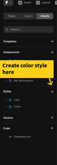
✅ Pro Tip: Only colors defined as Color Styles will respond to theme changes. Do not use static hex values.
🧱 Step 2: Apply Color Styles to Your Layers
To make your design responsive:
- Go to each text, background, and icon layer.
- Apply one of your Color Styles (instead of hard-coded values).
⬇️ Step 3: Add the Theme Toggle Component to the Canvas
Drag or paste the Framer theme toggle component into your canvas. It will immediately enable theme switching across your entire site.
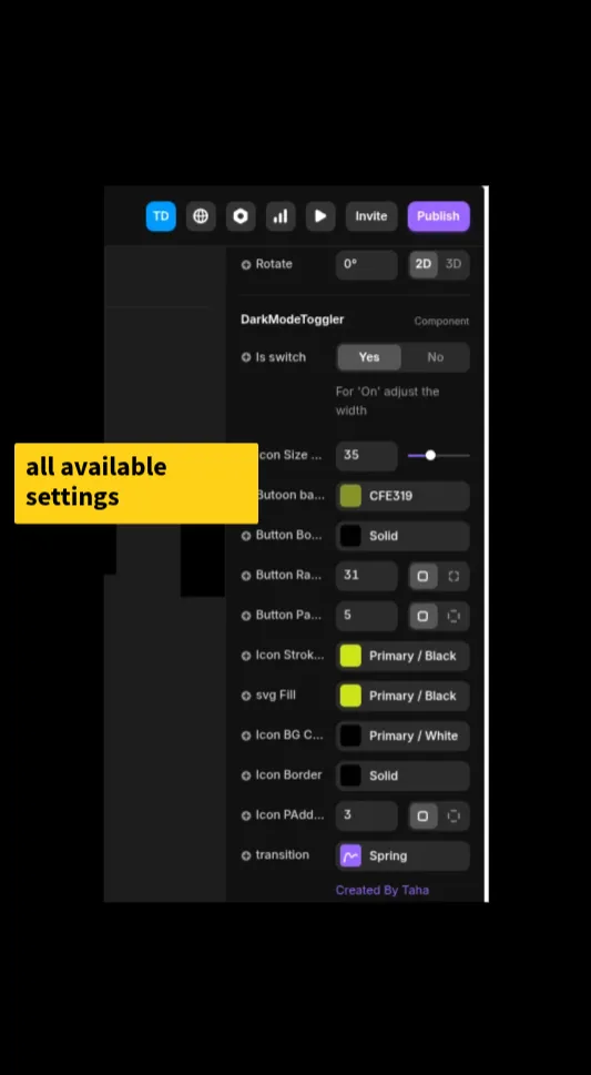
🛠 Step 4: Customize the Framer theme toggle component Properties
You’ll find a wide range of visual controls to match your site’s look and feel.
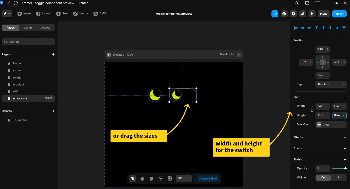
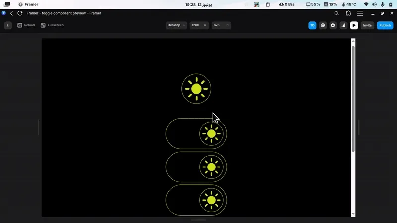
🔘 Switch vs Button Mode
Choose the toggle style:
- Button: Resizable. Set width/height or drag manually.
- Switch: Appears like a traditional toggle. Resize width as needed.
🌟 Icon Size
Use the slider or input field to control the icon size independently of the component.
🎨 Background, Border, Radius, and Padding
- Background: Use a color style for dark/light switching.
- Border: Customize width, color, and style (dashed, solid, etc.).
- Border Radius: Round or square corners, with individual control.
- Padding: Adjust spacing between icon and button edges.
🖼 Icon Styling
Customize:
- Icon Stroke
- SVG Fill
- Icon Background
- Icon Border
Always use color styles to allow theme switching.
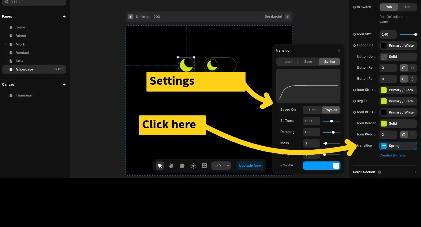
🎬 Transitions
Control animation:
- Duration
- Ease In/Out
- Delay
Make your toggle feel smooth and delightful.
✅ Recap
With Framer theme toggle component, you get:
- ✅ Seamless dark/light switching
- ✅ System preference support
- ✅ Local theme memory
- ✅ Complete visual customization
- ✅ Native Framer experience
Just follow these 4 steps:
- Define color styles
- Apply to all layers
- Add component
- Customize appearance
🧠 Local Theme Memory
The Framer theme toggle component stores the visitor’s theme preference using localStorage — so they return to the same mode they chose last time.
🎥 Watch the Tutorial
Want a visual walk-through?
💬 Final Thoughts
The Framer theme toggle component is a must-have for any Framer designer or developer creating multi-theme experiences. It’s responsive, intuitive, and saves time. I hope it delivers great value — and becomes part of your core Framer toolkit.